
AmplifyChange: A Rebrand That Reflects the People Behind the Movement
AmplifyChange's new identity honors the work of local change-makers in Africa and South Asia.

Welcome to On-brand by Brandfetch—the weekly scoop on the most intriguing rebrands, brand evolutions, and fresh identities shaping your favorite products.
🌱 From Grants to Growing Movements
AmplifyChange started in 2014 to help small, local groups working on sexual and reproductive health and rights (SRHR). Many of these groups, especially in Africa and South Asia, had trouble getting international funding. AmplifyChange was created to change that.
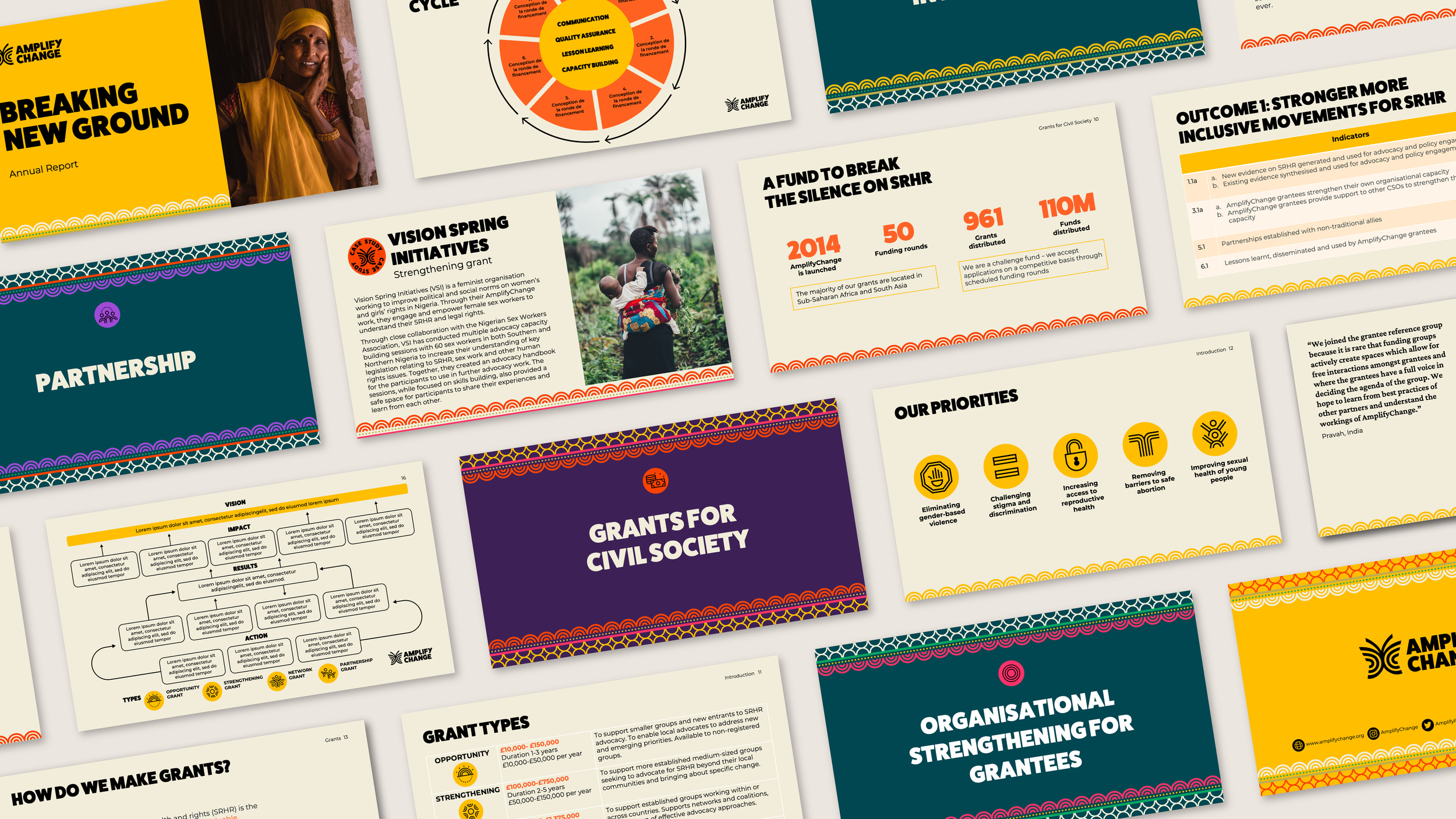
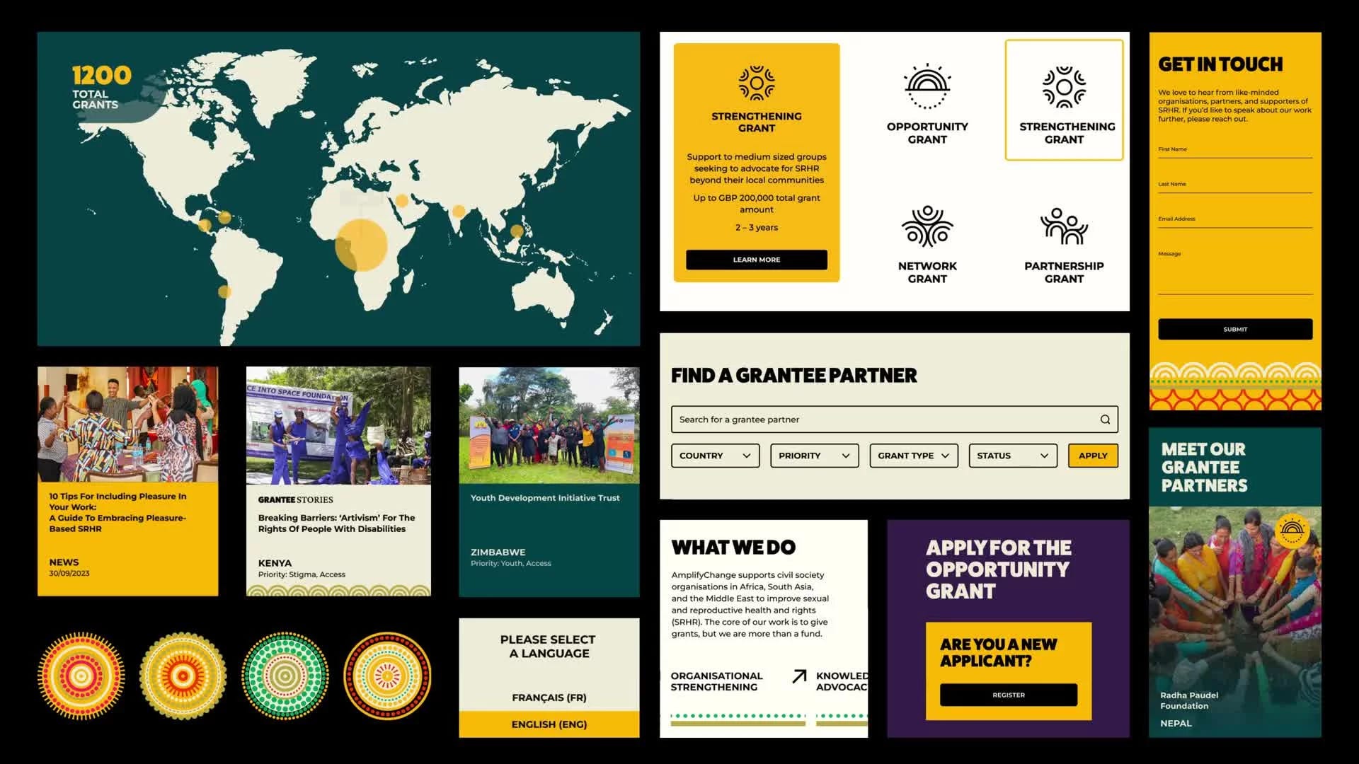
Over the past 10 years, they’ve given out nearly 1400 grants and expanded what they do. They now go beyond just giving money—they also provide resources, support learning between groups, and help build strong advocacy movements.
But as the organization grew, it became clear the old brand didn’t reflect who they had become. It was time for a change.


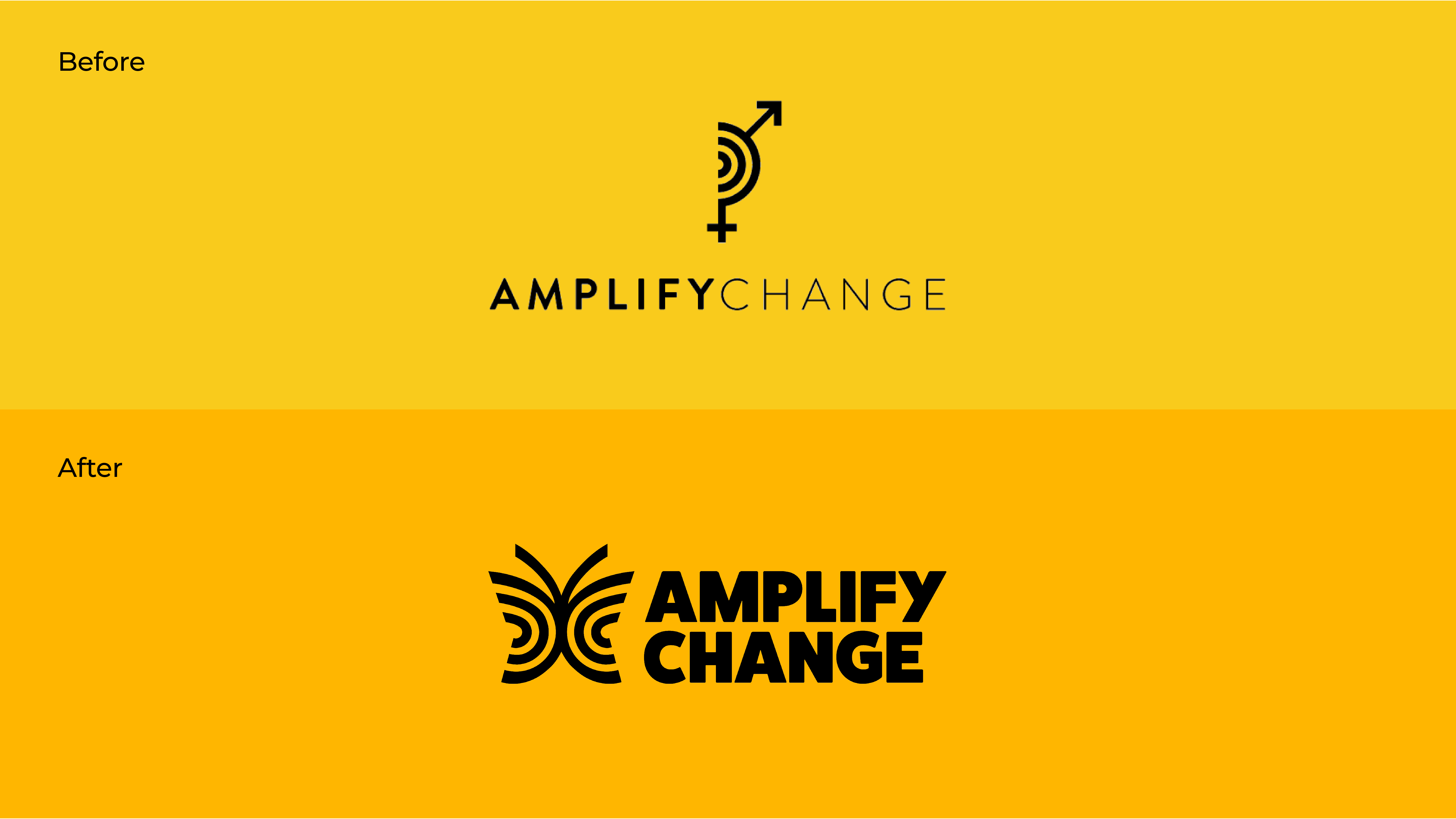
🦋 A Butterfly with a Message
The old logo, with a half-circle and gender symbols, was recognizable but not very accessible. It didn’t show how much AmplifyChange had grown.
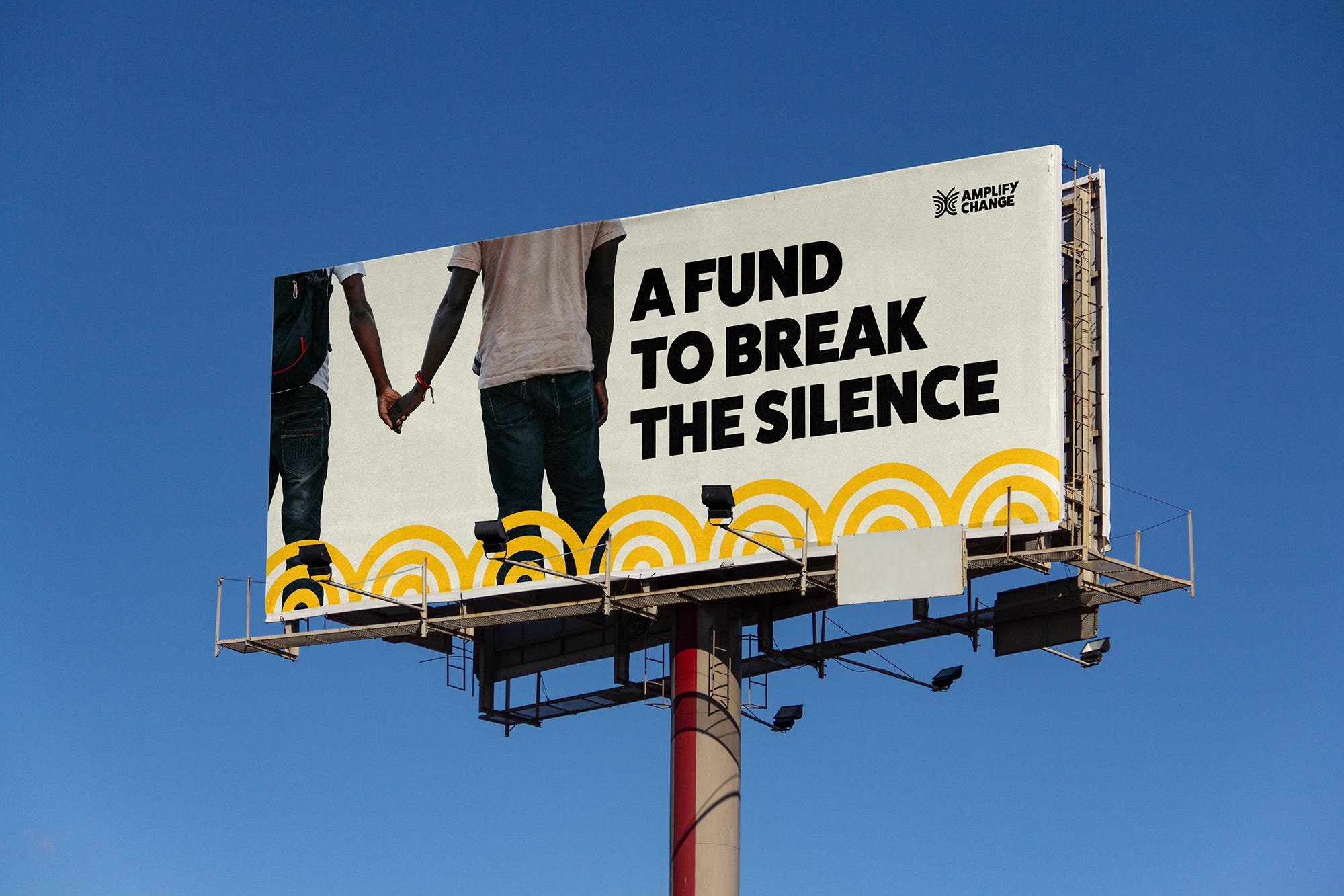
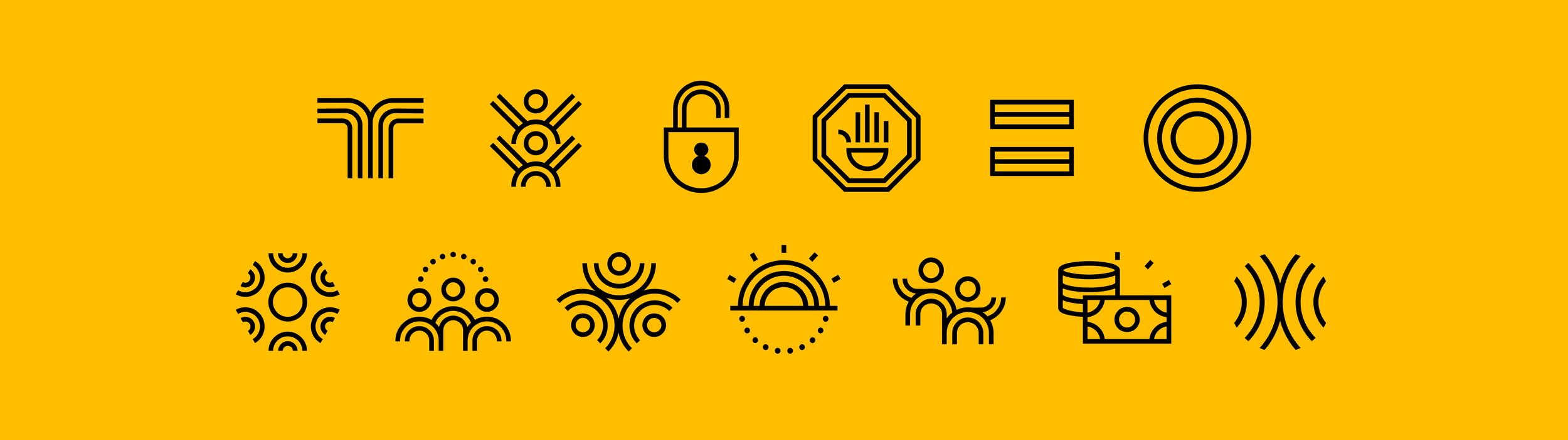
The new logo features a butterfly—keeping the radiating lines from the old logo, but adding wings. The wings stand for partnership and shared action between local organizations and donors. The butterfly also stands for growth, transformation, and freedom.
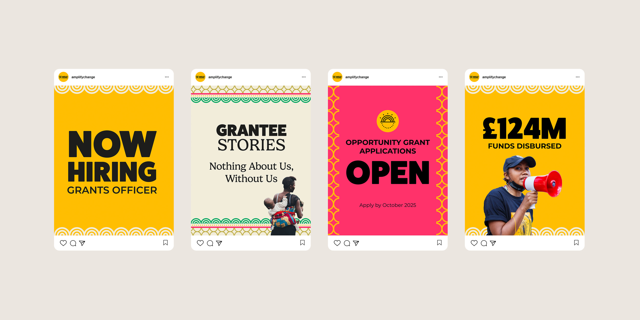
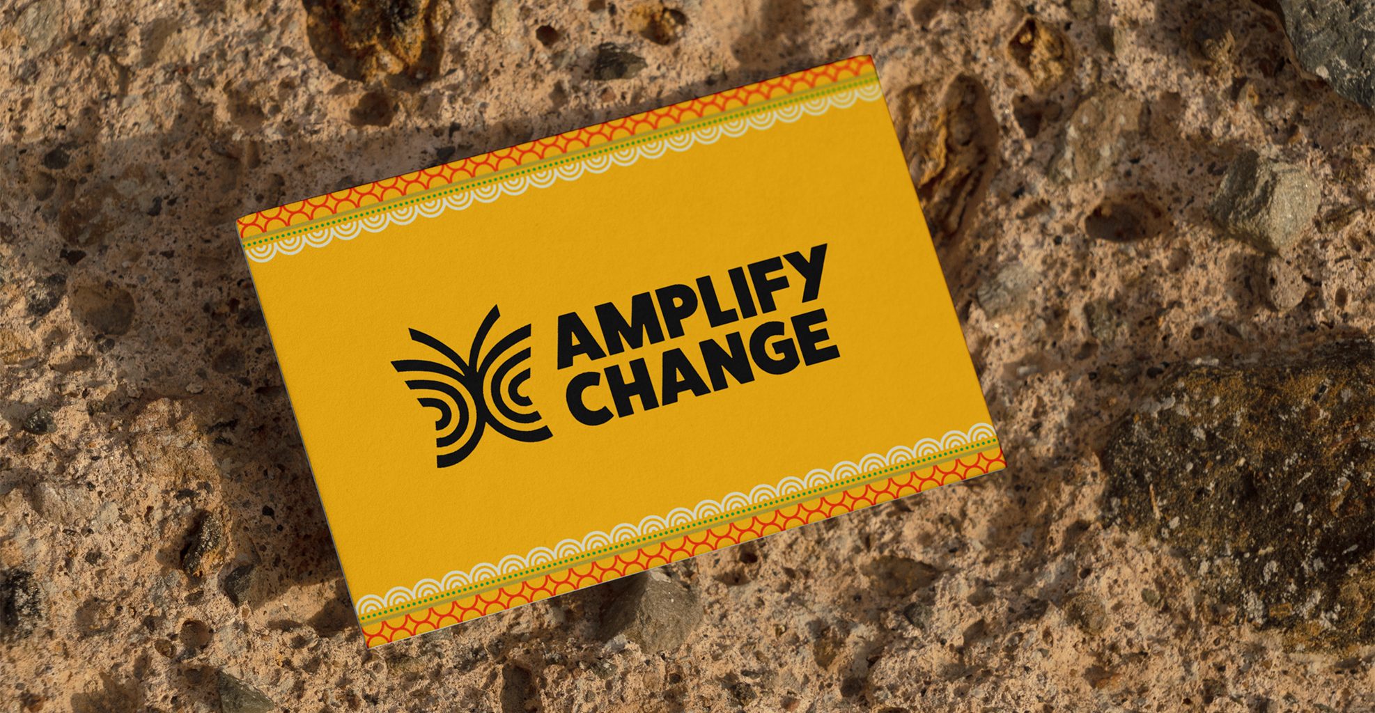
They kept gold from the old color palette, then added bright, bold colors inspired by fabrics and patterns from the regions where they work. This new look celebrates the energy of their partners.
They also created a new visual pattern based on the radiating lines. It shows up across their website and materials, connecting the brand to the local cultures and people it supports.


🤝 A Team Effort with Studio Sana
AmplifyChange chose Studio Sana to lead the rebrand. Their approach was participatory and aligned with AmplifyChange’s values.
The process started with an audit and research into similar organizations. Then came focus groups, surveys, and interviews with grantee partners, donors, and the AmplifyChange team. Everyone’s voice mattered.
Studio Sana also redesigned AmplifyChange’s main website and their learning platform, AmplifyChange Learn. The result is a refreshed brand that works across all platforms and clearly reflects who they are.
For AmplifyChange, the brand is about more than just looks. It’s about showing the world that they stand with the people doing the hard work every day. As Katie Northcott said:
“They’re the ones doing the bold, brave work. Our aim is to show up as a partner who stands beside them—visually and practically.”
—Katie Northcott, Communications Manager at AmplifyChange

🌊 Amplifying Change by Design
This rebrand isn’t just a new logo. It’s a celebration of 10 years of impact and a commitment to supporting local voices that drive change.
The butterfly may be new, but the mission stays the same: amplify change from the ground up.
📰 Read These Next:
See you next week!
From your friends at Brandfetch 👋