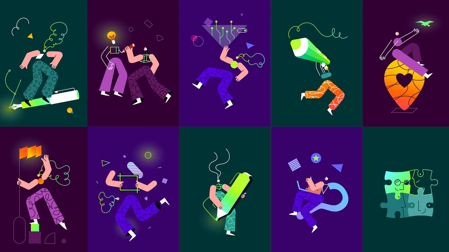
Creatopy's Rebrand 🌟
‘Creatopy’ is a blend of ‘creation/creativity’ and ‘utopia’.
Hello Brandfolks!
This is our 10th edition of the #RebrandSeries🎉, if you have any feedback so far, just let us know!
Today, we’re sharing the story of Creatopy, a company that helps businesses customize, automate, and scale up their ad production and delivery.
We interviewed Teodora Gavrilut, Chief Operating Officer at Creatopy, who talked about involving the whole team in their rebranding, their ‘Glow’ as a representation of that creative “Aha!” moment, and the challenges in defining a new brand.
👀 The Change
💭 First Impressions
Creatopy's new brand expands their ambition, they're not about banners anymore, but anything creative. We like this new positioning, as well as the glowing effect on their logo which is very unique!
✨ The Highlights
On changing their name:
By 2019, we came to the conclusion that the product was too small for our ambitions. That was how we decided to go through a full rebranding process, changing the name and the visual identity while upgrading our mission and vision statements.
On the meaning behind 'Creatopy':
It's a blend of two words, “creation/creativity” and “utopia,” the name stands for the concept of perfect creation and vast imaginary potential--the best place for creativity.
On the meaning of their logo:
It encompasses three main elements: the C-monogram, which stands for Creatopy and creation; the Ideal—a sphere (utopia) and lastly, the Glow signifying idea, creativity, intelligence.
👇 Read the Whole Story
Discover the story behind Creatopy's latest rebrand.
This is our Rebrand Series where we interview designers and decision-makers behind rebrands.
Hope you enjoyed this week’s story. Tell us what you think and we’ll see you again next week!
From your friends at Brandfetch ✌️


