
Keeping It Real, Keeping It Vinted
Studio Kiln’s take on authenticity in second-hand fashion branding.

Welcome to On-brand by Brandfetch—the weekly scoop on the most intriguing rebrands, brand evolutions, and fresh identities shaping your favorite products.
🎨 A Rebrand Without the Noise
When we sat down with Charlie Hocking, Co-founder and Co-creative Director at Studio Kiln, the first thing he said stuck with us: “If you don’t push expectations, a brand just reverts to what it’s always been.” That line became a lens for how Vinted’s rebrand unfolded.
Vinted didn’t want a big splashy reveal. They wanted subtlety. Their challenge was clear: stay recognizable while fending off copycat competitors and expanding beyond fashion into categories like electronics and high-value items. They also had a brand platform, New Again, that needed to come alive visually. Kiln’s role was to make those quiet changes add up to something stronger.
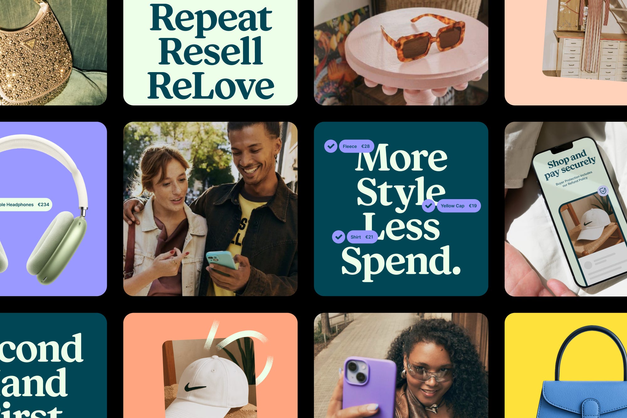
✨ Familiar, but elevated
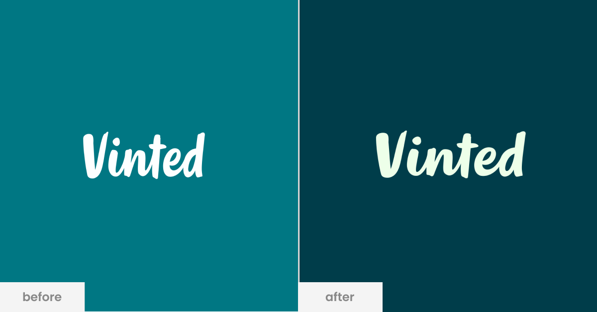
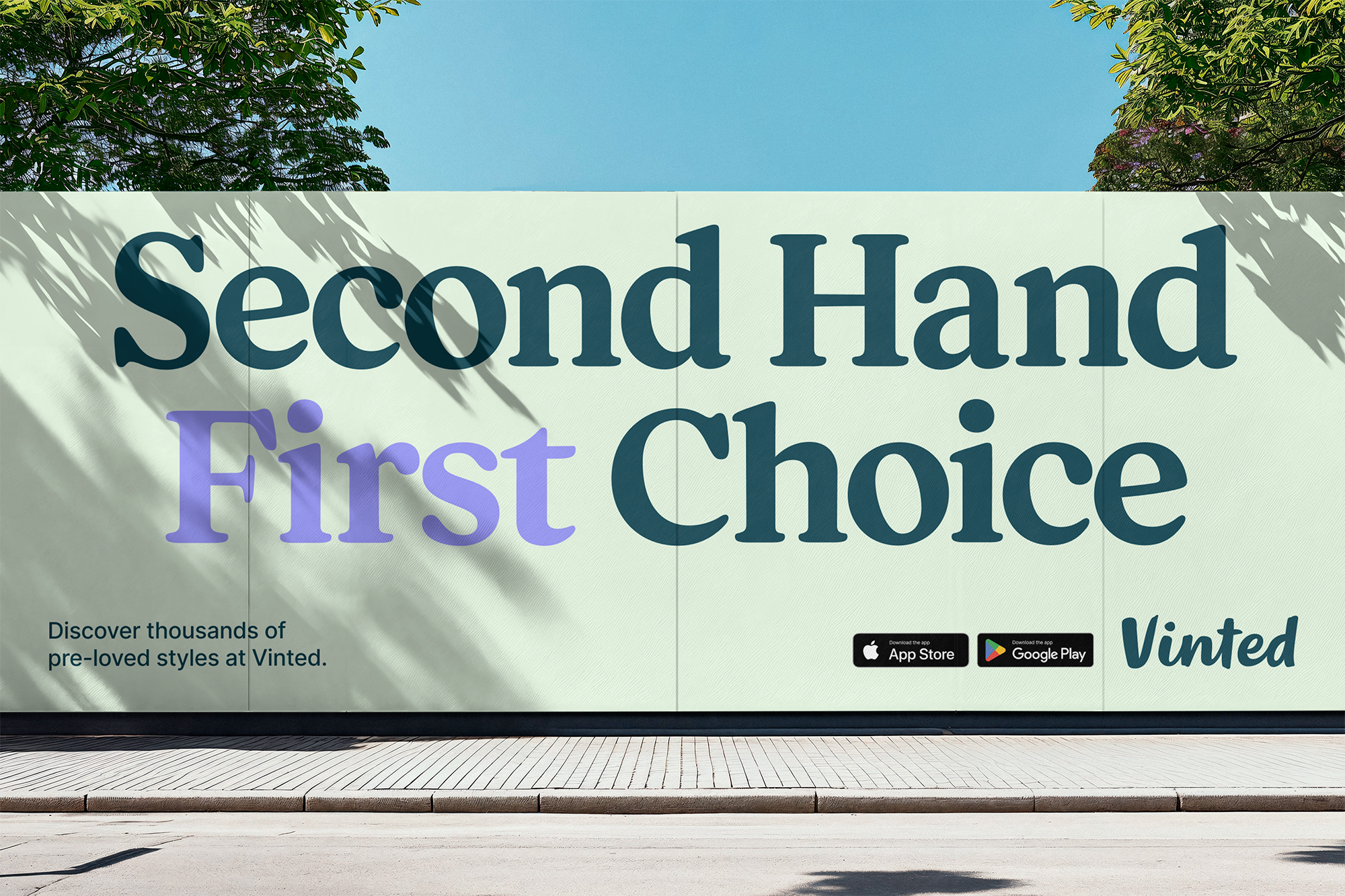
When Vinted first approached Kiln, one thing was clear: the handwritten logo would stay. Charlie told us the logo was untouchable: “It carried too much equity with the community to mess with.” So the work wasn’t about redesigning it, but about making everything else sing in harmony.
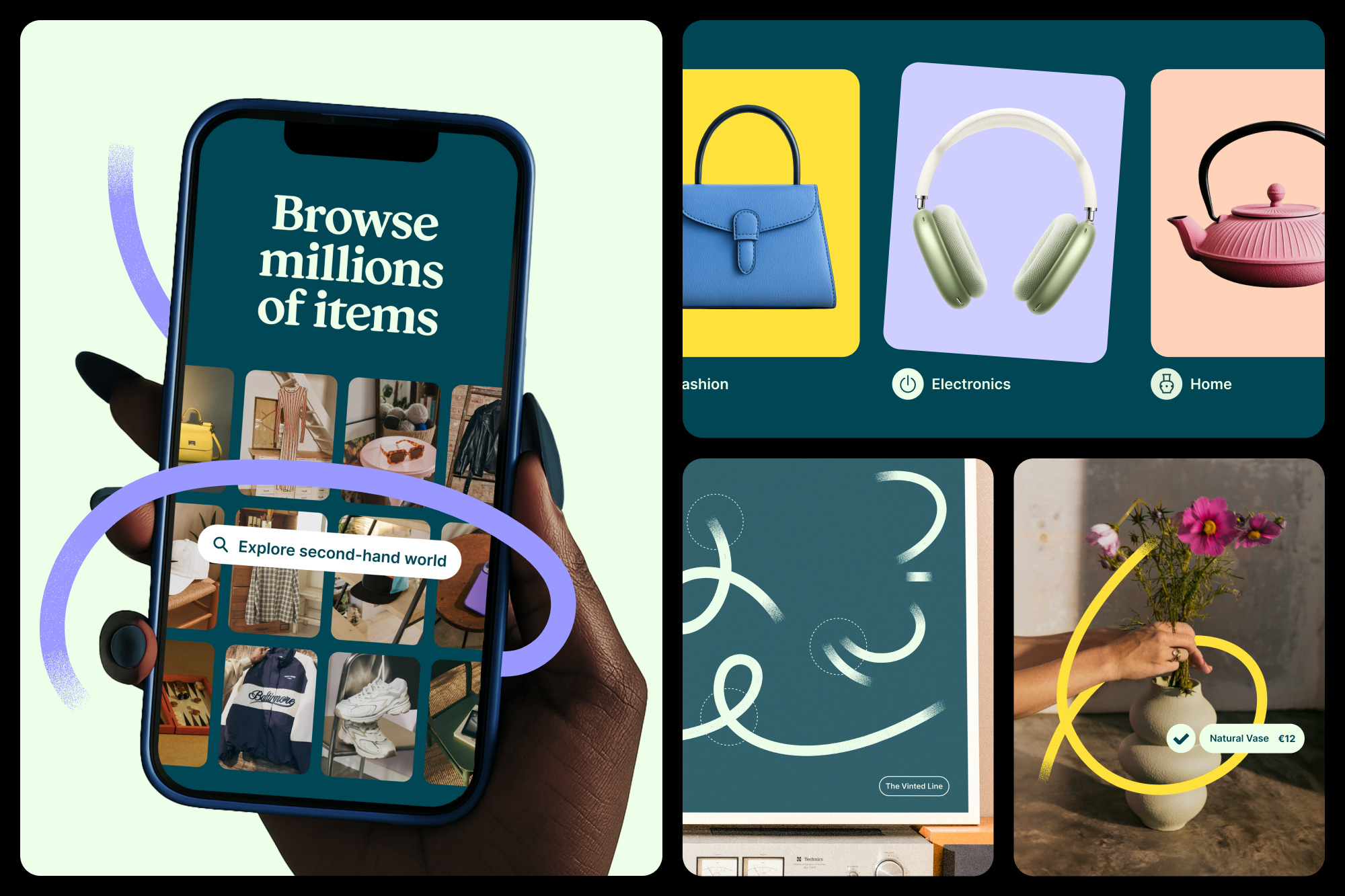
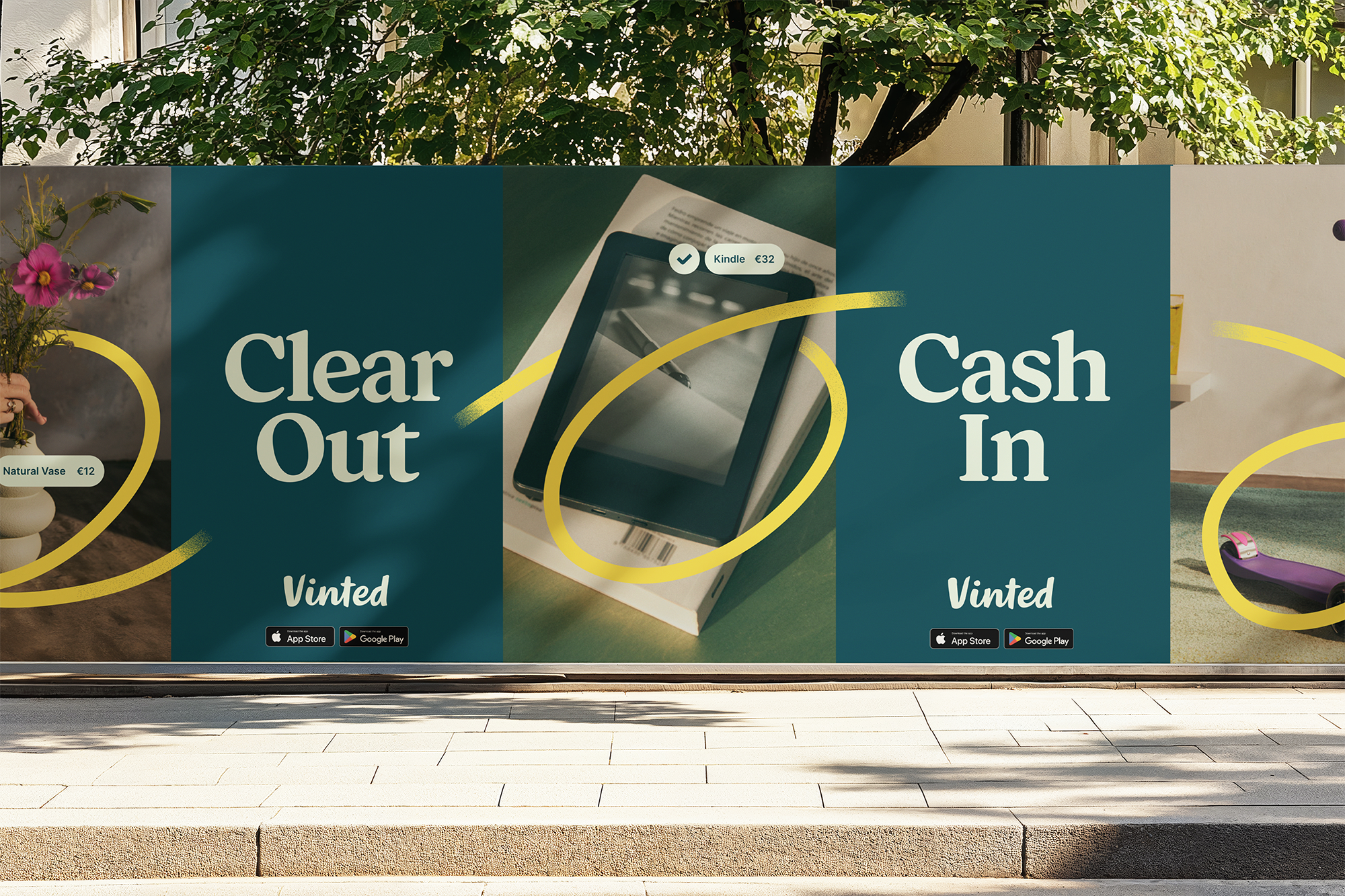
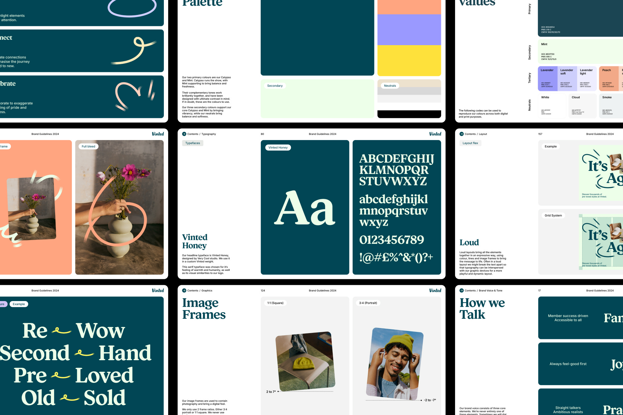
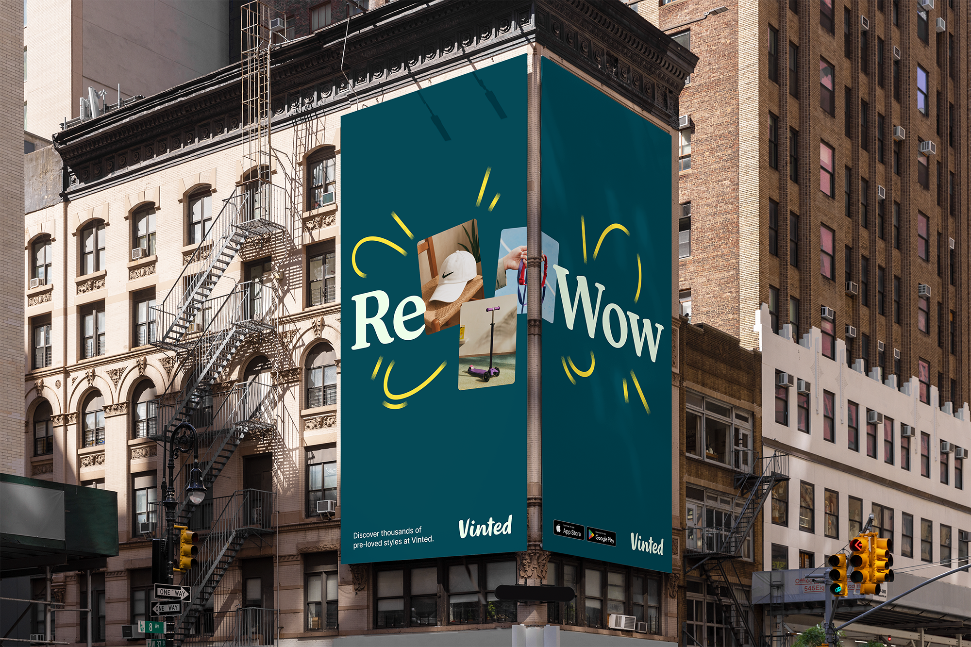
Colors were first on the list. Their signature teal, Calypso, had been imitated everywhere. Kiln pulled a darker teal already in the palette and elevated it, giving the brand maturity and distinction. They added a mint accent for freshness and simplified the rest. A new typeface — warm, approachable, and designed with Very Cool Studio — anchored the whole identity. The result? A brand that felt familiar, but sharper, more cohesive, and ready for the next stage of growth.
🧵💡 Stitching Values and People Together
Second-hand fashion isn’t about polish — it’s about people. That idea became the thread running through both design and process. Kiln unraveled Vinted’s handwritten logo into a continuous line: “That line could circle an item, connect a buyer and seller, or celebrate a moment of exchange. It’s intentionally imperfect, because that’s what second-hand is about — realness.”
But embedding community values wasn’t just visual. It also meant working hand in hand with Vinted’s internal team in Vilnius. Thousands of employees meant thousands of opinions, and resistance was inevitable. As Charlie put it, “The New Again strategy gave us a shared anchor. It kept us from drifting, even when people resisted change.”
The project stretched over a year, with gradual breakthroughs. One milestone was finding the right typeface: not hyper-modern, not corporate, but human and accessible. That choice grounded the identity, while the flowing line brought warmth and connection. Together, they stitched Vinted’s values and people directly into the system — design and collaboration reinforcing each other.
🌍 A Quiet Confidence
By the end, Kiln and Vinted had built an identity that didn’t demand attention but earned it. Users wouldn’t look at the app and think, “Oh, everything’s changed.” Instead, they’d feel it had grown with them.
Charlie smiled when he told us: “Design only becomes real when people interact with it. Seeing millions of users start to live the brand is incredibly rewarding.”
The rebrand is proof that sometimes the strongest statement isn’t a shout — it’s a whisper that feels just right.
📰 Read These Next:
See you next week!
From your friends at Brandfetch 👋