
Mindbody: Movement in Every Curve
If your logo still looks like it’s meditating in 2010, it might be time for a rebrand. That’s exactly what wellness-tech platform Mindbody decided to do. And honestly? It got its namaste together.

Welcome to On-brand by Brandfetch—the weekly scoop on the most intriguing rebrands, brand evolutions, and fresh identities shaping your favorite products.
🌀 A Logo That Founds Its Flow
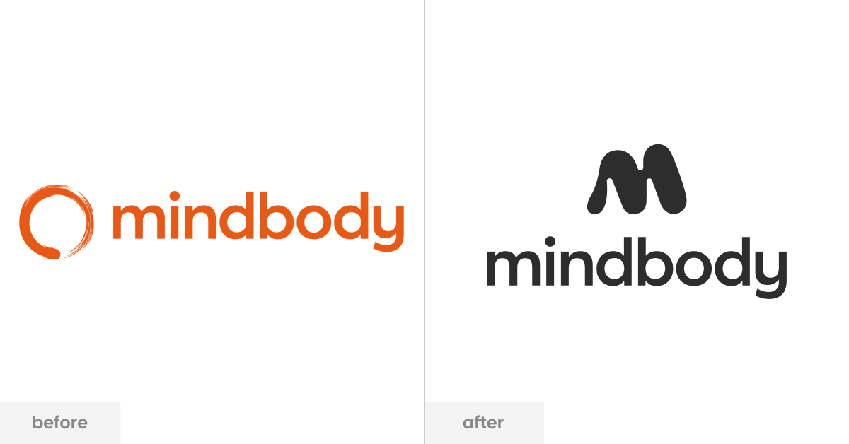
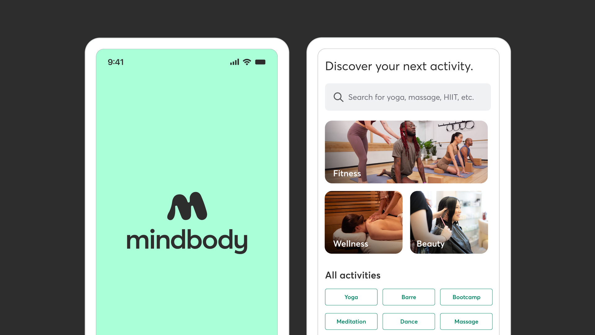
Mindbody ditched its old, overly literal lotus-in-a-circle look for a sleek lowercase “m” that’s curvier than a seasoned yoga instructor. It’s soft, flexible, and looks like it just finished a barre class.
This new mark is all about movement — a quiet nod to the actual bodies (and businesses) Mindbody supports daily.
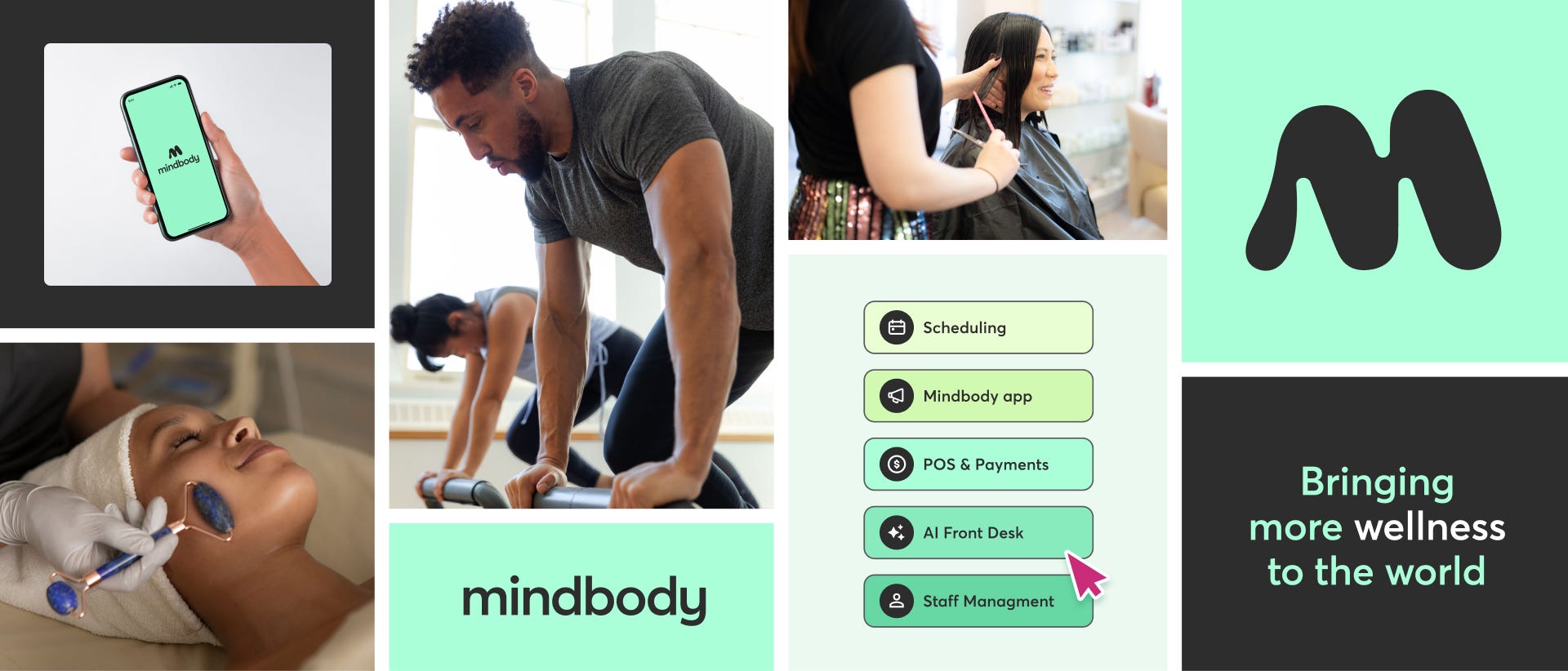
Because Mindbody isn’t just about booking pilates anymore. Over 20 years, it's evolved into a full-blown platform for wellness businesses — from boutique gyms to global fitness franchises. Scheduling? Yes. Payments? Yep. Marketing? That too. World peace? Give it time.
The brand needed to level up to match what it’s actually doing now.
👩🏼🎨 Designed in-house, because who knows you better than... you?
Rather than bringing in a fancy agency, the Mindbody team handled this one themselves. Bold move. But it worked. They brought in feedback from key customers — think Orangetheory, F45, the fitness glitterati — and molded a brand that actually fits.
Think soft gradients, motion-friendly design, and a new wordmark that actually lets you breathe.
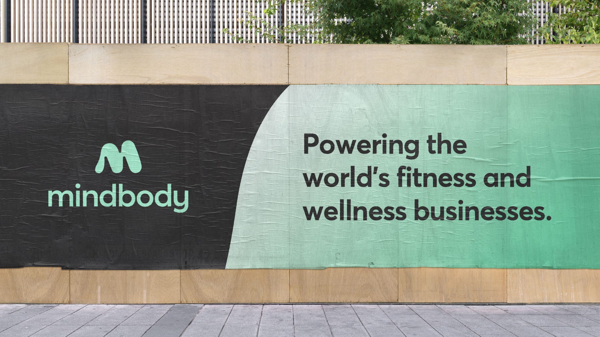
And let’s talk color. The updated palette leans into a refreshing spearmint green paired with grounding charcoal — a combo that feels equal parts vibrant and steady. Green speaks to vitality and growth (plants, progress, fresh starts), while charcoal keeps things clear and balanced.
But it’s not just a vibe — accessibility was a huge factor. The team rigorously tested color combos to ensure visual clarity and meet contrast standards. Turns out, making orange accessible is harder than it looks. So Mindbody opted for hues that not only pop but also include everyone. Energy, clarity, inclusivity — all in one palette.


🧘🏽♀️ Inhale, Exhale, Recap
Mindbody’s new brand is like your favorite yoga instructor: approachable, modern, and surprisingly strong. It flexes with the industry, meets people where they are, and signals that the company isn’t just a tech tool — it’s the backbone of the wellness biz.
"We wanted our brand to feel more modern, more fluid, and instantly recognizable—but most of all, to feel good no matter what kind of experience you’re looking for."
— Christina Libertini, Creative Director at Mindbody
📰 Read These Next:
See you next week!
From your friends at Brandfetch 👋