
Shutterstock’s Ripple Effect: Creativity in Motion
A conversation with Meg Vázquez-Pastrana, Head of Creative at Shutterstock, on how the rebrand shows a brand that’s not just just keeping up but reshaping the creative landscape in ways worth noticing

Welcome to On-brand by Brandfetch—the weekly scoop on the most intriguing rebrands, brand evolutions, and fresh identities shaping your favorite products.
🎨 From Stock Images to Creative Engine
Back in 2003, Shutterstock started as a scrappy stock image startup. In 2007, it got its first formal brand identity: a tight logo with a viewfinder “o” that shouted photography. For years, the look stayed constant. But the company didn’t. Over the past decade, Shutterstock expanded into new asset types, AI-powered tools, custom production, and Shutterstock Studios. This wasn’t just a marketplace anymore—it had evolved into a full creative engine. The old identity couldn’t keep pace. The rebrand wasn’t just overdue; it was inevitable.


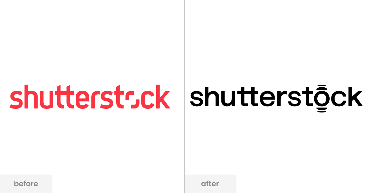
📷 The Viewfinder Closes, the Ripple Spreads
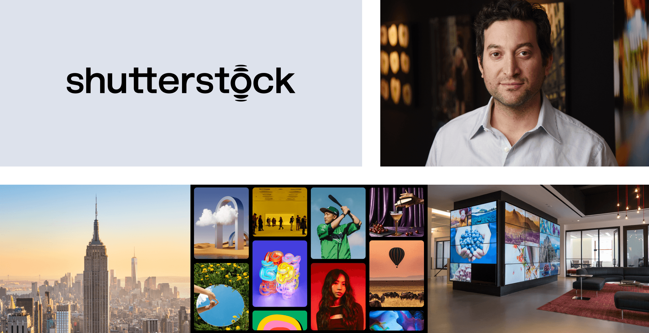
The iconic “o” in Shutterstock’s word mark has closed its viewfinder and made way for a ripple—symbolizing impact, expansion, and reach. This isn’t a decorative tweak; it’s a strategic choice. The ripple effect represents how ideas travel—one creative action setting off waves. The rest of the word mark is still familiar, intentionally so. The rebrand isn’t meant to shock—it’s meant to evolve. And with animation, the ripple becomes a living storytelling tool across campaigns, products, and creative experiences.
“The ripple effect is a symbol of expansion, reach, and how our brand creates impact.”
— Meg Vázquez-Pastrana, Head of Creative at Shutterstock

🎨 Colors, Collaboration, and Crafting Change
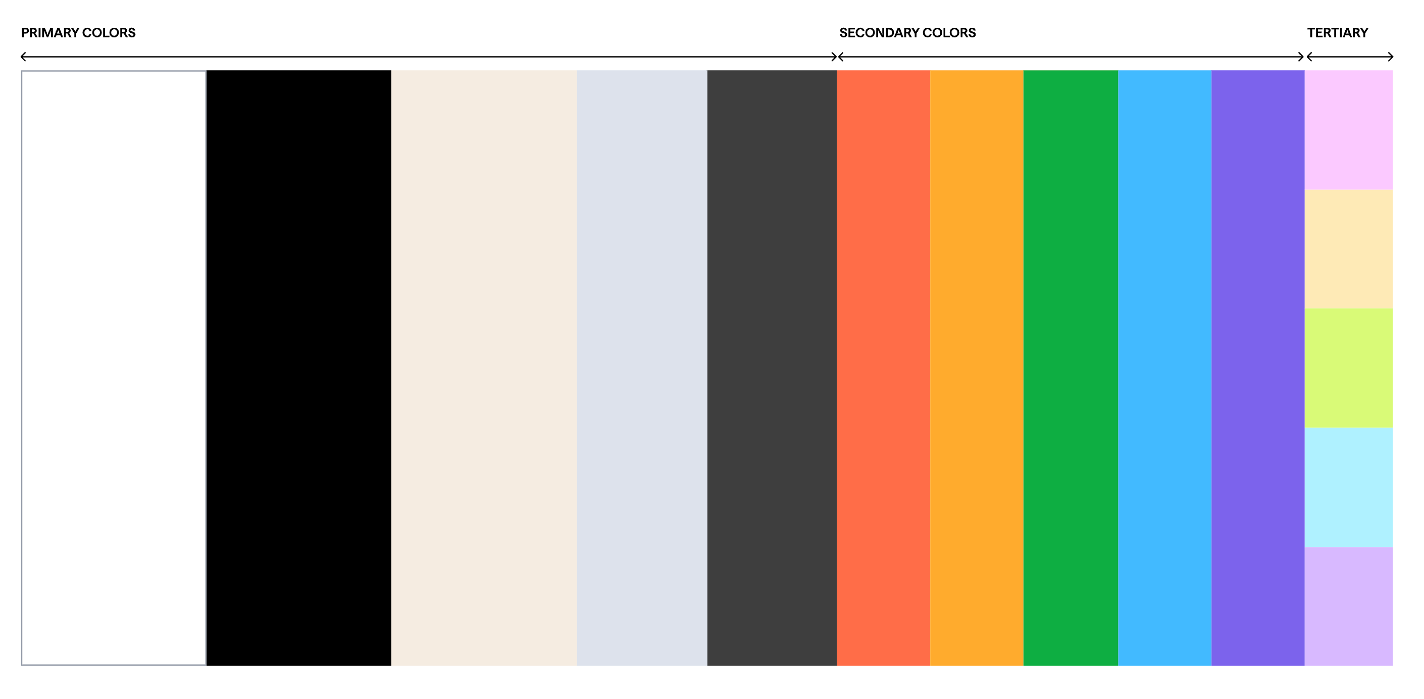
Once, Shutterstock’s color toolkit was basically a uniform: red, black, and white. Simple? Sure. Sufficient for a brand that now lives across products, campaigns, and experiences? Not even close. Today’s digital stage calls for range. The new palette anchors itself in versatile neutrals (black, white, tan) but brings in sharp pops of “highlighter” colors—the same ones you’d find on sticky notes, file folders, and creative desks everywhere. It’s a system that can shout or whisper, depending on the moment.
And the way this change came to life? Not in some sealed-off design lab. While an agency helped shape the strategy, the creative heavy lifting happened in-house. The team pulled in voices from leadership, comms, product, UX, and even legal. The toughest hurdle wasn’t alignment—it was time. Balancing a living, breathing business with a full-scale rebrand is no easy feat. But the payoff was huge: everyone, from marketers to engineers, had fingerprints on the work. That collective investment turned the rebrand from a project into a shared win.


🤝 A Partner, Not Just a Platform
The rebrand signals a shift in how Shutterstock shows up for its customers. It’s no longer just a stock content provider—it’s a creative partner. The new tone is spirited, impactful, and relatable, reflecting its ambition to meet customers wherever they are. From independent artists to global brand teams, the message is clear: Shutterstock exists to fuel great work, on your terms.


📰 Read These Next:
See you next week!
From your friends at Brandfetch 👋