


🎨 When Design Sees What Others Miss
Design doesn’t need to shout. The quietest ideas often make the biggest impact. This week, we spotlight two projects asking: what if design could feel, include, and heal—not just sell?

Welcome to On-brand by Brandfetch—the weekly scoop on the most intriguing rebrands, brand evolutions, and fresh identities shaping your favorite products.
🏠 First up: Packaging You Feel, Not See


Alexandra Burling’s Colour Me Blind began as a design school project—but it quickly evolved into something far more thought-provoking. Her concept was simple but radical: redesign common grocery packaging so it could be used by the visually impaired. She started by conducting interviews and even attempting to navigate daily tasks blindfolded to better understand the user experience.
She focused on grocery items—milk, cornflakes, canned tomatoes—because of the clear lack of Braille information on such packaging. From there, she designed tactile, Braille-embossed packaging that communicated both product content and how to open it.
For the school’s graduation exhibition, Burling transformed a small room into a supermarket experience. One person at a time entered the space. After 20 seconds, the lights were turned off. Left alone in the dark with ambient sounds like cash registers and store announcements, participants had to identify and explore each product by touch.
This wasn’t just about accessibility—it was about empathy, multi-sensory communication, and challenging the visual bias of modern design. The project sparked meaningful conversation and demonstrated how packaging could be inclusive, practical, and deeply human.


🍷 Then: A Toast to Beautiful Flaws
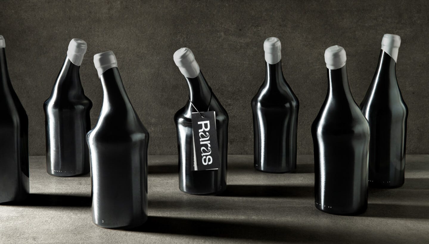
Meanwhile in Spain, Bodegas Arráez tackled a different kind of invisibility—the kind that happens in factories, where imperfect wine bottles are deemed unusable and tossed aside. Their project, Raras (“Rares”), reclaims these flawed vessels and transforms them into a celebration of uniqueness.
Each Raras bottle is distinct: some are slightly bent, others have misshaped necks or bubbles in the glass. Instead of hiding these “errors,” the winery chose to highlight them as part of the product’s identity. The branding leans into the concept, using hand-drawn typography and vibrant label designs that feel as unfiltered as the bottles themselves.


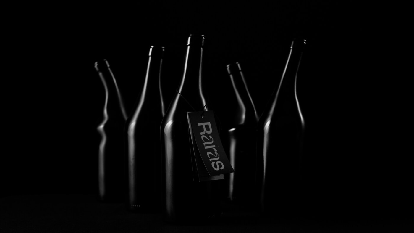
But Raras isn’t just a statement about aesthetics. It’s also a partnership with FEDER, a Spanish foundation that supports people with rare diseases. A portion of every sale goes directly toward funding medical research. The bottle becomes a metaphor: like the wine inside, people with rare conditions are often misunderstood, overlooked, and still full of life and value.
Through this initiative, Bodegas Arráez offers a new way to think about imperfection—not as a flaw, but as a mark of character. The project fuses sustainability, inclusivity, and purpose into a single, memorable brand story.
✨ The Big Idea
Whether it's tactile packaging for the blind or wonky wine bottles made wonderful, these brands remind us: great design sees what others miss.
It feels. It includes. It connects.
📰 Read These Next:
See you next week!
From your friends at Brandfetch 👋