


Don’t Fix What Isn’t Broken. Evolve It.
Swisscom didn’t need to rebuild its brand — just sharpen it for the future. Here’s how they evolved without losing their essence.

Welcome to On-brand by Brandfetch—the weekly scoop on the most intriguing rebrands, brand evolutions, and fresh identities shaping your favorite products.
🛜 Swisscom’s Rebrand: Strong Roots, Fresh Signal
When you’re Switzerland’s #1 telecom provider with 98% logo recognition and decades of national trust, a rebrand sounds risky. But that’s exactly what Swisscom did — not out of crisis, but from a position of strength.
We spoke with Nicolai Reuland (Program Lead) and Pascal Frey (Creative Director) about simplifying an already-iconic logo, and aligning teams across the organization around one refreshed promise: “Discover your possibilities.”
📶 Legacy Built on Trust
Swisscom started out as Swiss PTT — the country’s postal, telephone, and telegraph service — and slowly changed into a private company (though the state still owns a bit more than half). Even with that shift, it stayed grounded in Swiss values like quality, innovation, and trust.
In today’s tightly held telecom market, Swisscom shares space with just a few other major players (Sunrise and Salt), yet continues to lead in mobile, internet, and telephony. But the rebrand wasn't driven by competition or crisis. Instead, Swisscom saw strength as the right starting point.
“We weren’t fixing something broken. We started from a place of strength—and to stay on top, you have to keep evolving.”
—Nicolai Reuland, Progam Lead at Swisscom
This meant making sure the identity stayed true to what people already love about Swisscom, while future-proofing it for the next decade.


🧠 Co-Creating With Intent
Swisscom partnered with London-based Wolff Olins for this latest evolution. The goal? A rebrand that felt fresh, but didn't abandon their legacy. The pitch process brought a wide spectrum of ideas — from radical to reserved — but Wolff Olins struck a middle ground that felt just right.
What made the partnership work was its collaborative spirit. Even during the pitch, Swisscom was thinking, "What if we co-create this brand together?" That mindset carried through the project. While syncing two large organizations took time, it ultimately resulted in a shared vision.


Swisscom made it clear from the start: no matter how bold the ideas, they weren’t willing to give up the things that mattered most — trust, quality, and innovation.
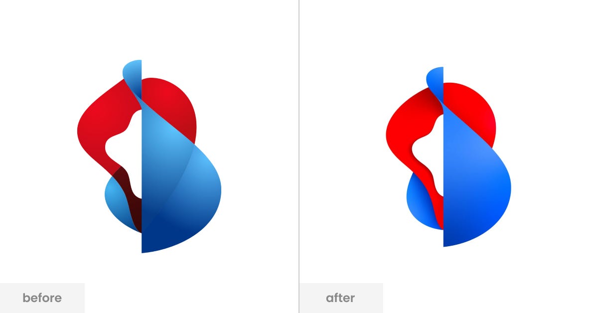
The logo wasn’t supposed to change at first. But as the project moved forward, it became part of the update too. The flowing shape, first introduced in 2008 and refreshed in 2019, was already familiar to most people. It stood for connection and stability. Instead of replacing it, they made it work better for today’s screens and added more movement — keeping the spirit, just making it sharper.

✨ Aligning the Brand from the Inside Out
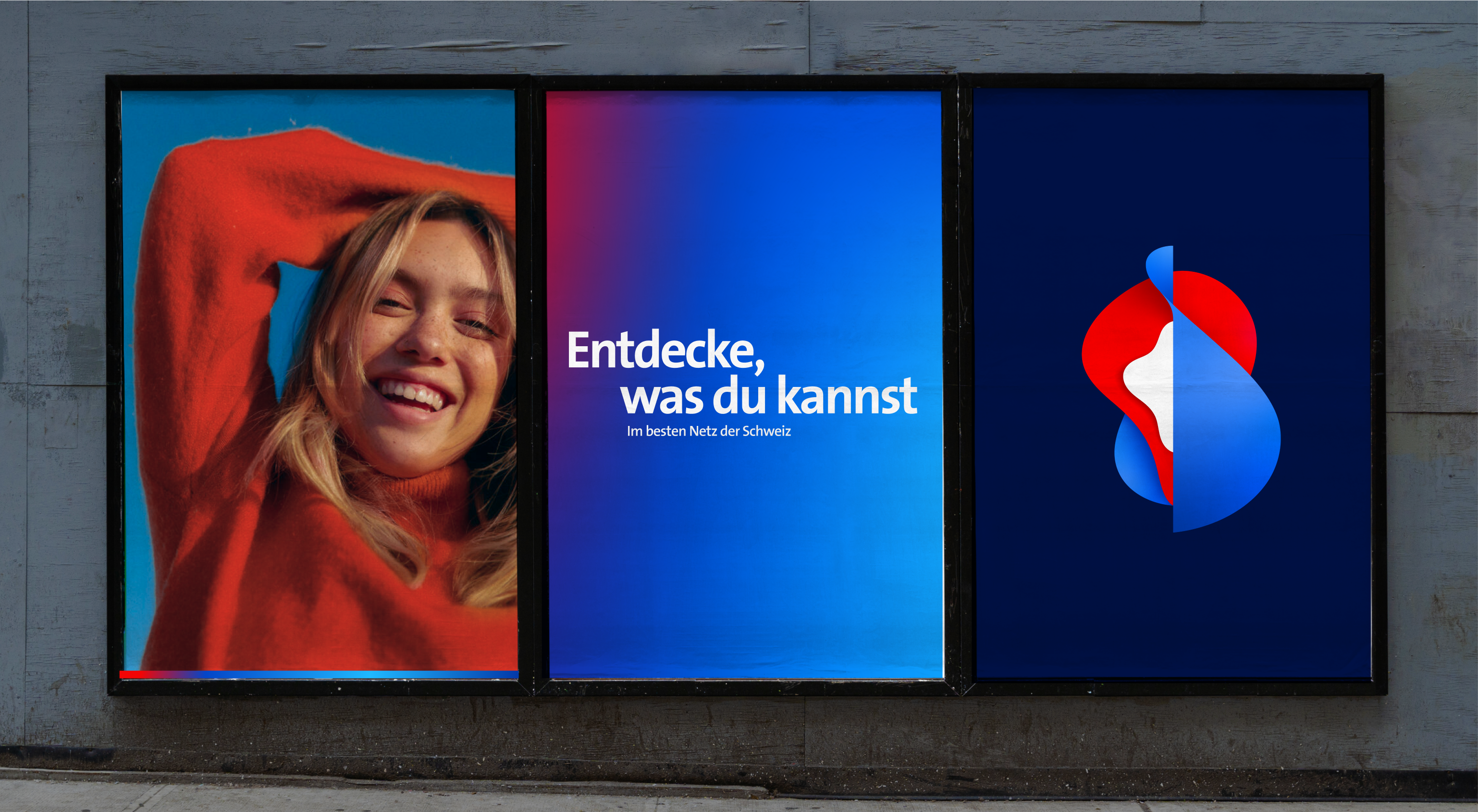
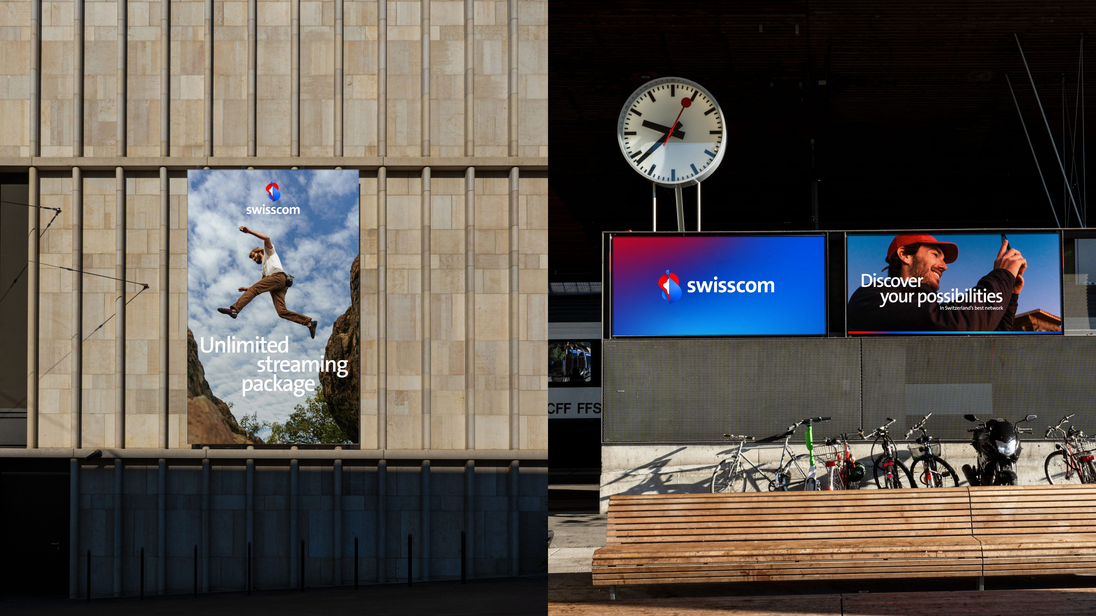
Though the rebrand introduced visual changes — lighter design, motion assets, a new layout system, and refreshed colors — the biggest shift was in positioning. The previous tagline, "Ready," had served Swisscom well, especially during COVID. But it started to feel static. Like a runner poised, but never launching.
"Discover your possibilities" marks a move from preparation to progression. It signals movement, ambition, and optimism.
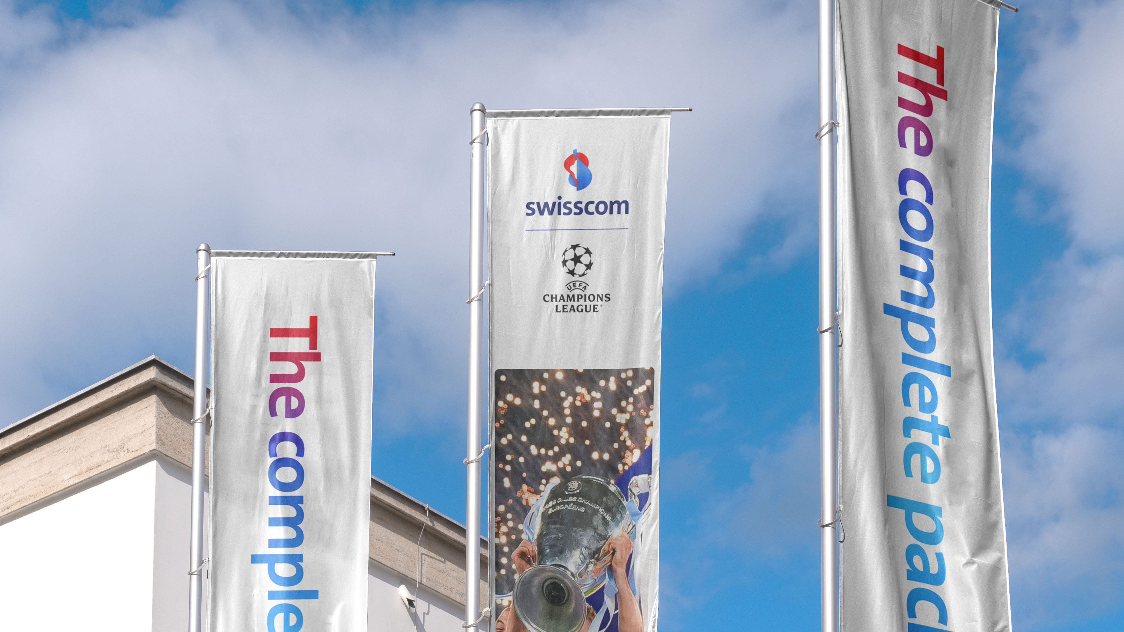
This mindset wasn’t just about campaigns — it had to translate across all of Swisscom. That meant aligning every business unit, from B2C and B2B to employer branding and events. In a company of over 20,000 people, that kind of consistency takes precision.
Clear direction and strong internal collaboration helped Swisscom avoid common rebranding missteps. With everyone aligned on the new direction, the rollout felt seamless—and all the more powerful for it.


📰 Read These Next:
See you next week!
From your friends at Brandfetch 👋