🏞️ How do you visualize a specific location in your branding? See how this park is doing it.
Branding to illustrate something as diverse as a park or even a state can be challenging. It isn’t always straightforward because you want to be respectful of different areas.
For Washington State Parks’ Brand and Creative Lead, Stephanie McDermott, she says it’s all about asking the right questions:
We began our rebrand process from a place of curiosity and really took stock of where we were as a brand – do the stories we tell resonate with our communities? How do the visuals we use represent our values?
Brand is about emotion and perception – but how do you catalogue a feeling? How do you quantify a moment? We started with memories and asked people from all around the state to share their favorite state parks memories. They were able to craft a logo that puts their client relationship at the forefront while rebranding into a new brand identity and system that can work with any size and setting.
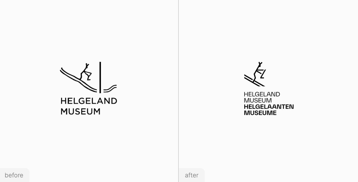
From diving deep into this park’s rebranding, other big rebranding news include Helgeland Museum’s new logo and publicly-traded Allscripts making a completely new change to Veradigm.
Read more about recent design stories below!
⛷️ Smoother Lines
This museum in Norway updated its logo and has a new visual identity to go with it. Read more.
🌳 Quote of the Week
Blending a visual identity people already love and rebranding to showcase more diversity is a tough line to tread. Stephanie McDermott of Washington State Parks shares that they had to be strategic in knowing what to change and what to keep.
Stephanie shares more about the design details behind their new brand since the 60s! Read our full interview here.
💊 Very Different
The change is the completion of the brand's transition to the new brand that started in 2022. Read more.
📖 Read These Next
See you next week — Your friends at Brandfetch 👋


