


👽 Meet the Monsters Behind Your Inbox
From ‘sending scaries’ to inbox glory—how a rebrand gave email its epic glow-up.

Welcome to On-brand by Brandfetch—the weekly scoop on the most intriguing rebrands, brand evolutions, and fresh identities shaping your favorite products.
📊 From Idea to Inbox Beast
Inbox Monster was born from a crew of long-time industry friends with one big idea: build an all-in-one email tool that covers everything—from pre-send checks to post-campaign reports. It quickly became a “monster” in the best way, powering millions of daily emails for airlines, retailers, and other enterprise giants where hitting the mark isn’t optional.
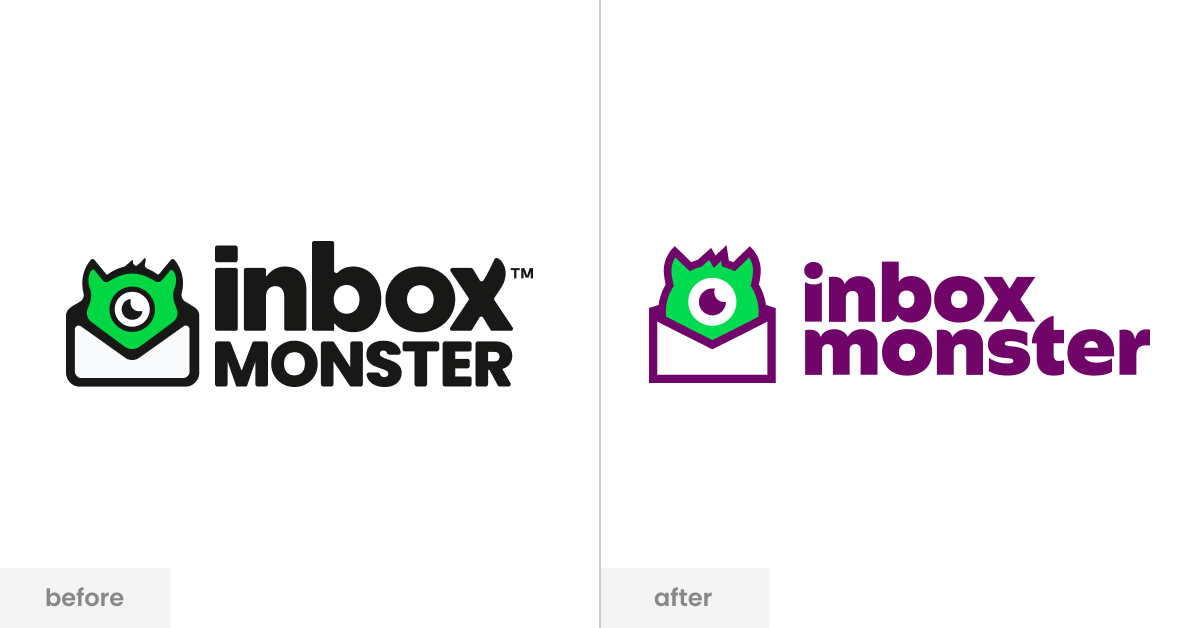
The brand always aimed for epic results, but as the product evolved, its visual identity lagged behind—stuck with a generic tech font and a patched-together look. Laura Sullivan, Head of Brand & Marketing, knew it was time to unleash something bigger.


💡 The Three-Word Formula: Expert. Fun. Epic.
When your clients trust you with sensitive, large-scale email programs, authority is non-negotiable. But email can feel intimidating—so Inbox Monster leaned into a trio of traits: Expert, Fun, Epic. Too much fun risks losing credibility, too much “expert” risks going cold. The rebrand found the sweet spot—keeping expertise front and center, injecting approachable energy, and scaling up the impact.
That balance extended into the visual system. The team designed a custom typeface—chunky, playful, and infused with subtle monster cues like the smile line from Monstie’s eye and horn-like accents—that tied the whole identity together. This, along with new patterns and textures built to work with the Monster Mark, gave their design toolkit far more flexibility than before. As Laura puts it, the goal was simple: remove the “sending scaries” and make every interaction feel as confident as it looks.


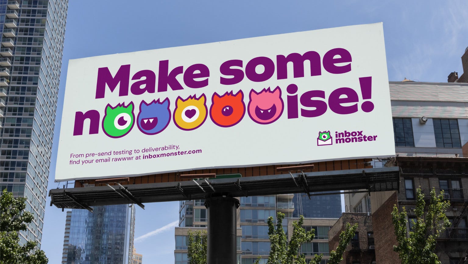
💜 Meet Monstie (and Friends)
The brand’s lovable mascot, Monstie, was already iconic, but previously trapped inside an envelope. The rebrand set it free—expanding into a whole cast of Monsties with new expressions, colors, and quirks to match the brand’s vibrant new animation style. The design overhaul went deeper, too: a custom typeface inspired by historical fonts, infused with subtle “monster” touches, and a flexible new set of textures and patterns. It’s all about giving the brand room to play without losing its authority.
To bring this vision to life, Inbox Monster partnered with Verve Agency—drawn in by their B2B SaaS expertise and proven creative chops. From kickoff in November to launch in June, it was a cross-time-zone collaboration that delivered not just a new look, but a full brand system ready to grow.
🌟 A Rebrand, A Promise
The rebrand gives Inbox Monster a dynamic foundation to expand its content strategy and amplify its voice in the email community. The next chapter? Using all that personality and character to create helpful, engaging content that invites more people to join the conversation—and maybe even embrace their own inner “inbox monster.”
As for the bold promise? It’s simple: epic emails, every time. That’s the rallying cry now, and the benchmark they want to be known for in five years. After all, in a world full of spam, scams, and “oops” moments, why not be the brand that makes hitting send feel a little less scary—and a lot more epic?
📰 Read These Next:
See you next week!
From your friends at Brandfetch 👋